
The real estate industry is constantly evolving, and as a result, there is a growing need for more innovative and user-friendly property rental and purchase websites. This case study examines a new and innovative property renting and purchase website and outlines the steps taken to improve the user experience.

The initial version of the website was facing several challenges, including a cluttered design, slow load times, and a confusing search function. This was leading to a high bounce rate and low conversion rates. In addition, the website lacked unique features that differentiated it from its competitors, making it difficult for the company to stand out in a crowded market.
Provide a user-friendly platform that connects property seekers with property owners, making it easier and more efficient for both parties to find and rent or purchase the perfect property, while providing a seamless and enjoyable experience for all users with 360 views and management system
I worked closely with my team over the course of 10 weeks. The project was kicked off with a stakeholder meeting that included the CEO of Jaan Properties to get a better understanding of the business goals and requirements. This diagram is a snapshot of the process I followed.

First, I needed a better understanding of the users, their needs, and the Rizurf platform.
I set out a few research goals and decided on the best research methods to achieve them:
1. Learn as much as possible about the Rizurf platform
heuristic evaluation
2. Learn as much as possible about users
user interviews & usability testing
3. Understand current solutions and the competitive landscape
comparative analysis
The purpose of the heuristic evaluation was to quickly and easily find usability problems related to user and owner signup and property listing. I went through the signup and product listing process while assessing the site against Jakob Nielsen's 10 general principles for interaction design. Below are the key issues I discovered.
The design of the website was cluttered and difficult to find properties as per user needs
The search function was confusing and difficult to use, making it difficult for users to find properties that met their criteria.
The only way to move from one section to the next in the form is to use the sidebar.
Inconsistencies in language and terms, and button placement throughout the site.
My goal was to learn from the users took to find properties on the platform. I wanted to find out if the process was easy for them, if there were any parts they were getting stuck on, and what they liked or disliked about the process. I used affinity mapping to pull out common themes and patterns among users.


Owners may put fake pictures or information about the properties listed. This can waste users' time and lead to frustration
The website may not have enough rental or purchase options available in the desired location, price range, or with the preferred amenities.
Users weren’t always sure how to move from one section of the form to the other.
Website's search and filtering options are limited, users struggle to find properties that meet their specific criteria.
I identified three online marketplaces that are common in Malaysia for finding properties. I looked at their user flows and the key features and incentives they offer to encourage users to view, rent and buy properties


At this stage, it was time to redefine the goal and narrow down its scope based on the insights gained from users.
The traditional property renting and purchasing process is time-consuming, stressful and lacks transparency, leading to frustration for both property seekers and owners
With user insights and a re-defined problem statement in hand, it was time to come up with solutions and validate them.
I kept the colors simple and chose a modern, variable Nexa font that is easy to read on all screens. Gave a variety of design options for logos and then started to work on the app design

I added clear labels and helpful instructions throughout the website. Gave it a very calm and soothing color combination with easy to use experience. The landing page has a search bar to immediately help the user get started to curate properties according to their needs

Upon search or clicking the listings on the landing page, the user can see the search results and can filter from so many options available

The existing form wasn’t intuitive enough for users to narrow down searches
Looking for Rent or ownership? filter it directly

Set flexible budgets to find the best property for you. Immediately see how many properties are available in your range. Customize as per numbers shown to avoid back and forth. Clear transparency
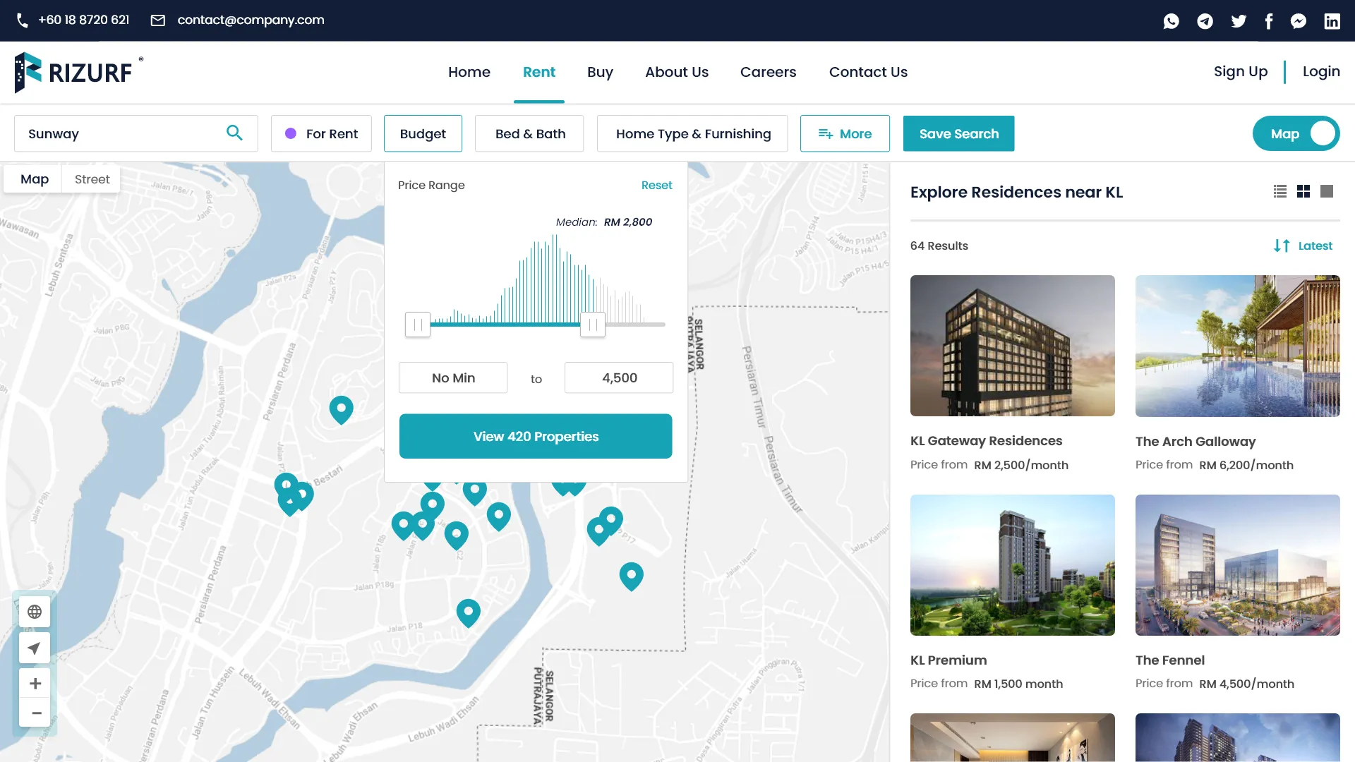
Choose your desired bedroom and bathroom numbers that fit your need

Select your ideal house preference and furnishing options

Select more and drill down your search further by property size, lot types and much more

Navigating the original site was a source of confusion for users
The entire experience is designed for users to keep on looking for properties without going back and forth. They can view in various layouts and find all details required in one screen.


See it in action
The prototype is launched and is now commercially available after testing.
An Interactive Property Renting and Purchase Website in Malaysia can provide a user-friendly and efficient experience for property seekers and owners.
I asked users how easy the new site was to use. 83% of users agreed that it was easy to use, up from 25% compared to the original form.
I asked users how satisfied they were with the redesigned listing process. 66% of users were extremely satisfied, up from 25% compared to the original form.
I believe that these improvements will translate into a higher rate of sales and rental agreements in marketplace, and in turn, more leads for Rizurf.
.png)
.png)
.png)
